Art Fund Website
Redesigning artfund.org from the ground up.

Art Fund is a fantastic charity with a fantastic brand identity…with a really tired and dated application online. We needed to better understand their audience to figure out how to make the site work harder for their needs. A quick review of their existing site reveals convoluted IA and a limited selection of CMS components without a clear hierarchy or brand voice.

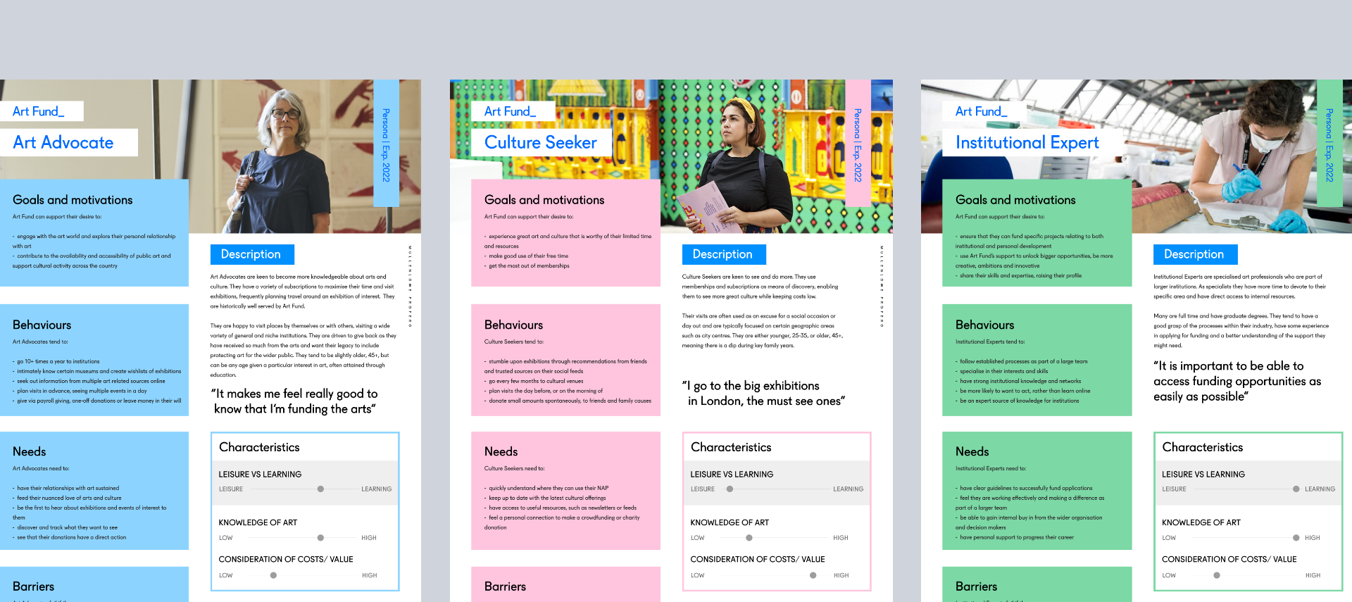
Strategy identified and created Art Fund personas helped to understand the real user needs and ensure the redesign is targetting key areas for improvement.

Whilst the discovery phase from UX and strategy was underway, I explored different ways to push the visual brand further digitally. Below was some of my initial design exploration.

Homepage
UX identified some key pages from our personas to improve and user test.

I used the wireframes as a rough outline to shape the design prototype.

Motion was a key part of the design process. It became a key workaround to the issue of wanting to show the art, but not being able to crop or cover it from a copyright perspective. These were some of my prototypes for how we might approach the homepage, that ended up going into user testing.
The final homepage in sprints evolved fairly drastically once the key messaging changed after input from user testing and the product owner. Motion remained a key part of the visual language.
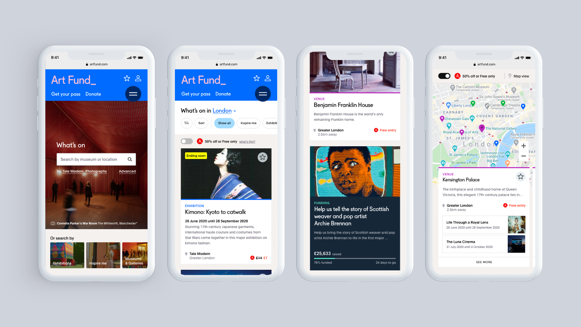
The What’s On journey
From the original wireframes…

…to prototyped designs

Again on this section I had the (primarily desktop breakpoint-based) challenge of needed to show art but being unable to crop any images. I proposed a gallery work around solution to this within the exhibition page, which tested well but ultimately was dropped.

The final solution I created for desktop was much simpler, but moved the visual design forward to a place we were all happy with.

National Art Pass purchase page
Purchases of the Art Pass are the driving force behind the Art Fund's charity work. As such, the page needed to work hard.

It was important for the Art Pass page to be adaptable. I designed the template to flex to reflect and current campaign messaging, so the user could mentally connect the messaging on and offline.

And the rest!
Holistic templates from therest of the website.
Holistic templates


