


E.ON wanted to reduce calls and encourage customers to self-help using online content. The problem: the existing E.ON help pages were contained within a third party plugin. This opened is a new browser window on mobile, which besides being jarring for the user, was buggy and antiquated to the point of being unusable.
Applying a the brand aesthetic to a complex and functional part of the interface was a challenge. In the early stages everything was deemed far too over-the-top.
An experimental interface was trialled in the form of a drag and drop style help icon. It gave the user absolute freedom to drag the marker around the page and question any aspect of the page dialogue. This was interesting but ultimately scrapped due to build complexity and screen obtrusiveness. Due to the large age range in our audience, it was also a concern the the system wasn’t intuitive enough to be universally understood.
A basic chatbot style of help and support was put through a user test to a fair degree of success. This approach was unfortunately deemed out of scope for this body of work by the development team, but later developed into a an innovative approach to E.ON’s quote acquisition journey.
We needed to figure out a method of help in a way that was discreet enough to be unobtrusive to the average user, but clear enough to catch users who were struggling.
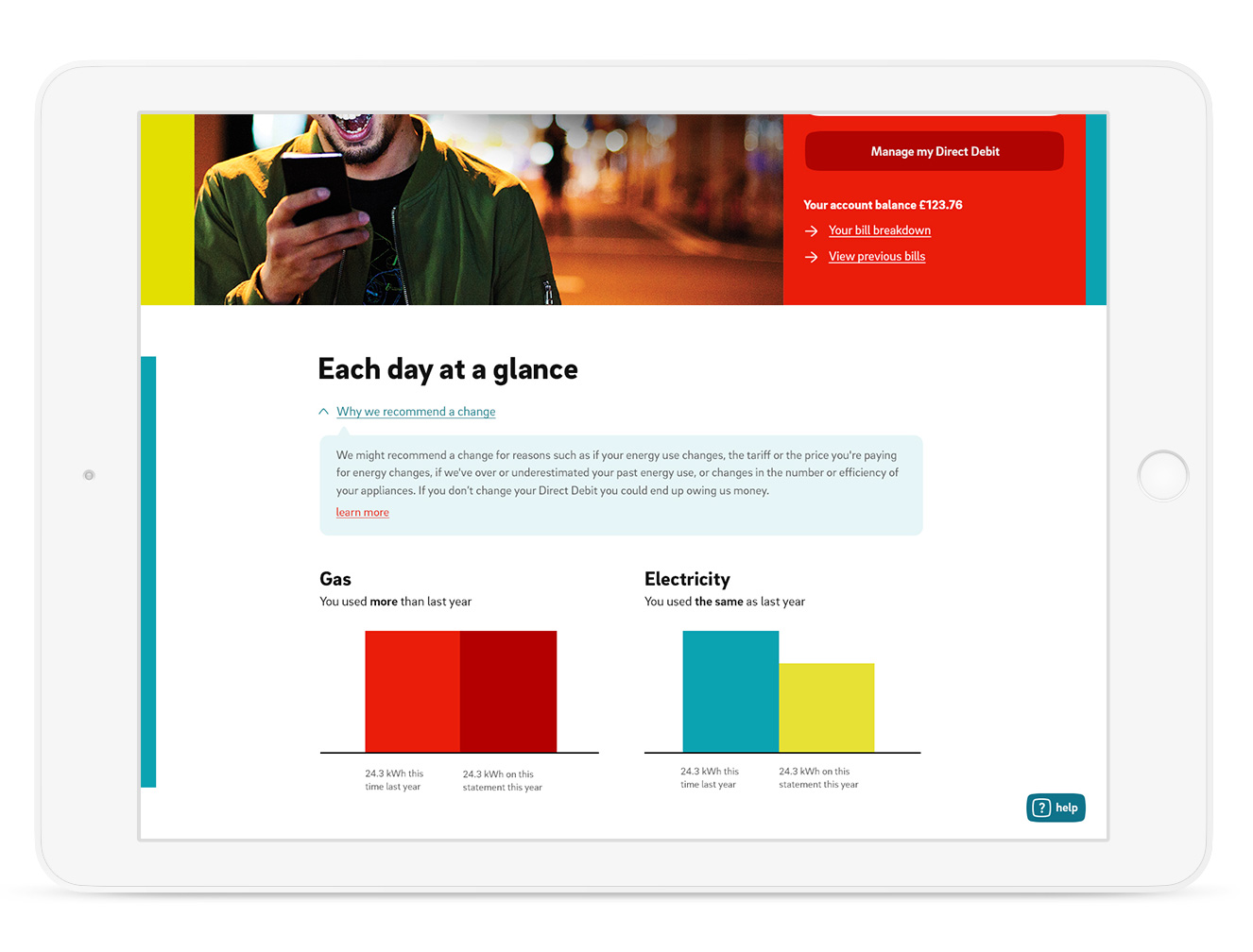
Problems were task based, and varied depending not just on the site section, but the specific area of the page. I needed help to be intelligent and adaptable.
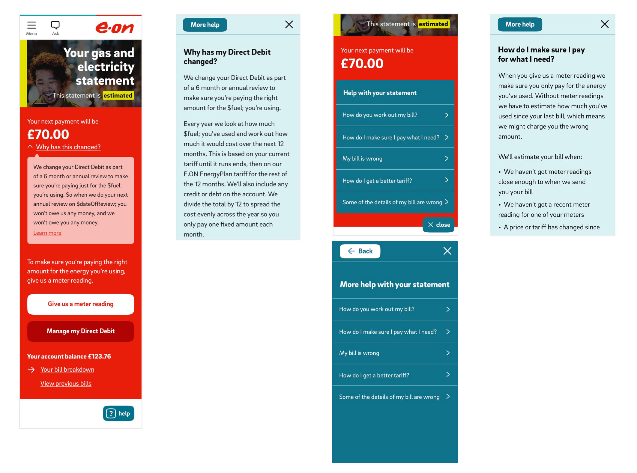
The UI application of the concept reduced the size and general screen-space allocated to help information considerably.
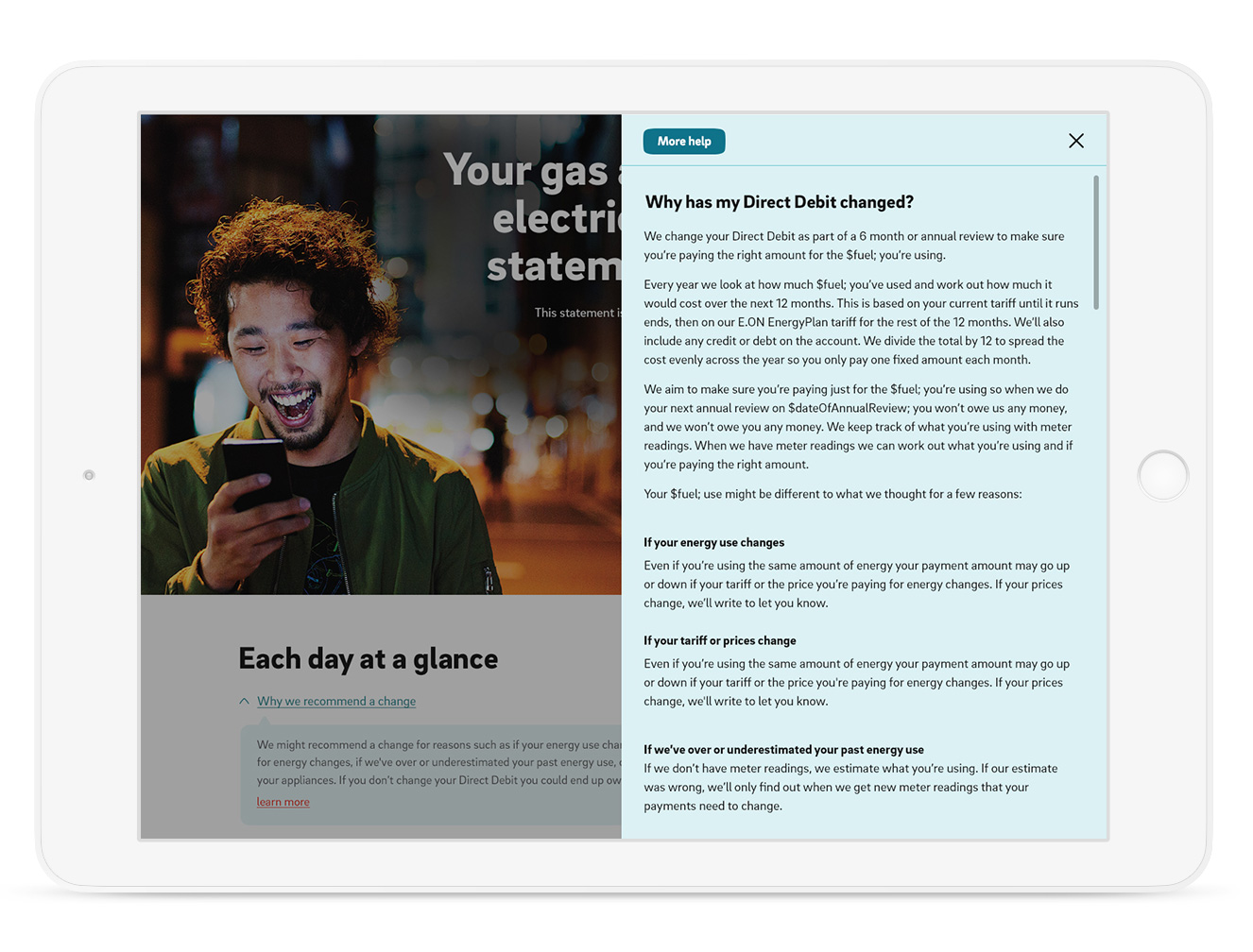
On a large desktop, a static mood panel was used as a slide-out help overlay space once triggered. This translated responsively to an overlay on smaller devices.
‘Inline help‘ was used in page for short form questions and answers. This was housed in a concertina rather than a classic icon, to create a clearer and easier tap area for touch screen devices.
‘In task help‘ was used in for longer form content, and contained in a stylised overlay.